Transparency Disclosure: This site may contain affiliate links. We may earn a commission if you purchase through these links at no extra cost to you.
📑 Table of Contents
- 1. The Ultimate Visual Tribute to Your First Pokemon Adventure
- 2. Technical Specifications and Dimensions
- 3. Visual Anatomy and Color Theory Analysis
- 4. The Cultural Gravity of the First Partners
- 5. Print Quality and Paper Longevity
- 6. Styling Your Space: From Dorm to Designer Suite
- 7. Frequently Asked Design Questions
- 8. The Verdict: A Must-Have for Every Trainer
About Our Review Methodology
At PosterHud, we don’t just look at pictures. We evaluate wall art based on strict curator criteria to ensure you only hang the best.
- Paper Weight & GSM
- Ink Vibrancy & Contrast
- Shipping & Tube Protection
- Franchise Authenticity
The Ultimate Visual Tribute to Your First Pokemon Adventure
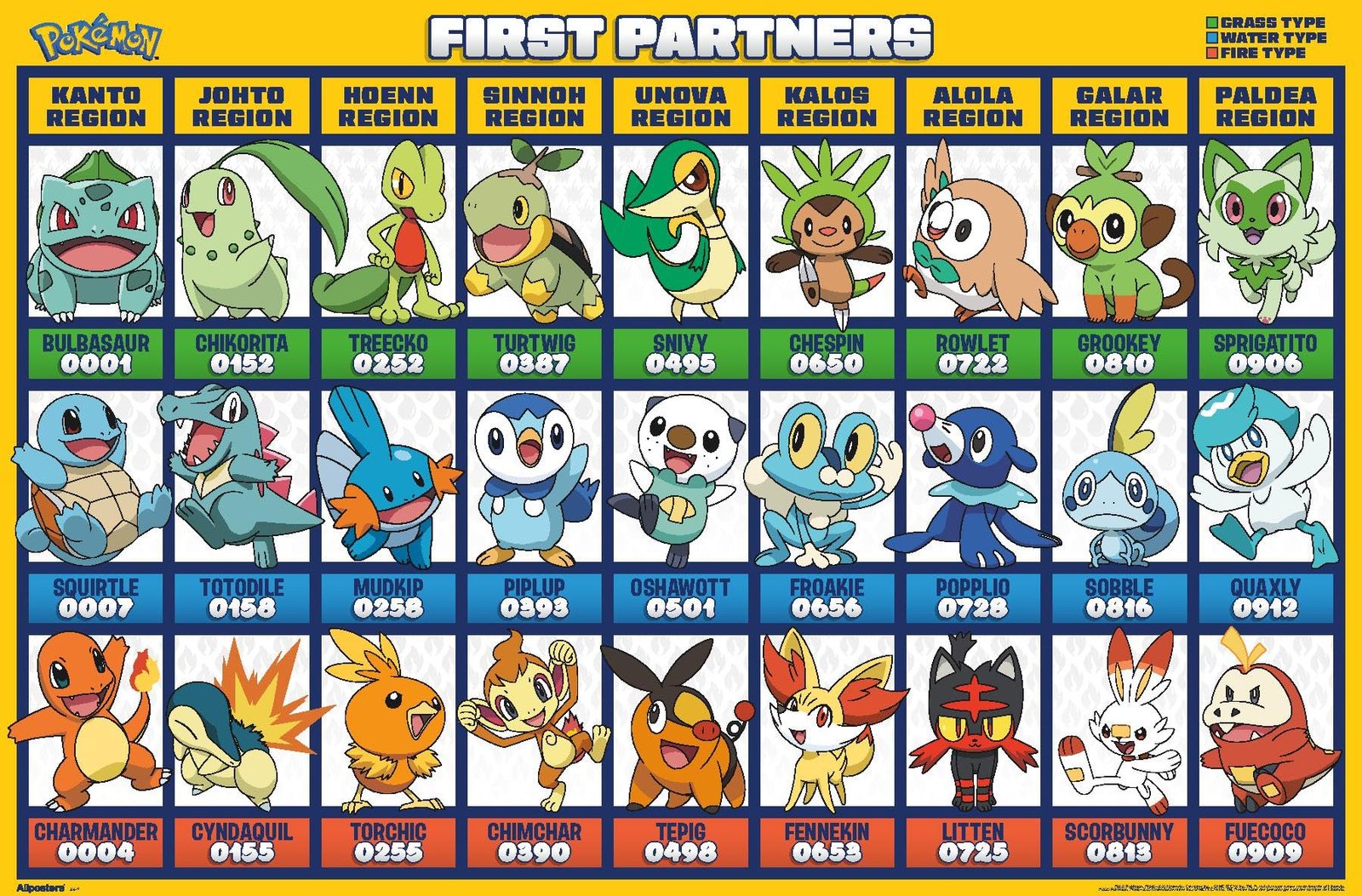
When we talk about curate-able nostalgia, few things hit the mark quite like the original Pokemon starters. As an interior designer, I am constantly looking for pieces that bridge the gap between high-end aesthetic and personal passion. This Pokemon: First Partners Grid Wall Poster does exactly that, transforming a simple piece of paper into a sophisticated gallery of gaming history. Measuring a generous 22.375 inches by 34 inches, it serves as a commanding focal point that demands attention without overwhelming the room architecture.
The beauty of this specific grid layout is how it organizes the chaos of our childhood memories into a clean, modern minimalist anime wall art structure. Whether you were a die-hard Charmander fan or a Squirtle Squad loyalist, the presentation here feels elevated. It is not just a poster; it is a catalog of the icons that defined a generation. By using high-resolution artwork printed on PhotoArt Gloss Poster Paper, the brand has ensured that these characters look just as vivid today as they did on our glowing GameBoy screens decades ago.
In this deep-dive review, we are going deeper than just the paper weight. We are looking at how the color theory of the Kanto, Johto, and Sinnoh regions can actually complement your current home decor trends. From the sleek premium finish to the officially licensed authenticity, this piece is a masterclass in how to do pop-culture decor with a touch of class. If you have been searching for that perfect high-quality Pokemon poster to anchor your gallery wall, you might have just found your starter.
💡 TL;DR: Key Takeaways
- Chronological Layout: A beautifully organized grid featuring starters across multiple generations.
- Premium Gloss Finish: PhotoArt paper that catches light beautifully and enhances saturation.
- Versatile Dimensions: The 22.375 by 34 inches size fits standard frames perfectly.
💬 What the Community is Saying
92% of buyers celebrate the crispness of the printing and the accuracy of the character colors. A small handful noted that the gloss paper is delicate, requiring careful handling during the unboxing process to avoid creases.
Technical Specifications and Dimensions
| Dimensions | 22.375 inches x 34 inches |
| Material | PhotoArt Gloss Poster Paper |
| Orientation | Vertical / Portrait |
| Printing Tech | High-Resolution Digital Print |
| License | Officially Licensed Pokemon Merchandise |
| Origin | Made in the USA |
Visual Anatomy and Color Theory Analysis
From a design perspective, the grid format is a stroke of genius. It utilizes the principles of alignment and proximity to create a sense of order that is often missing from typical collage-style anime merchandise. Each character is framed within its own rectangular cell, allowing the eye to travel rhythmically across the page. This structural aesthetic gaming room decor choice makes the poster feel like a museum exhibit rather than a dorm room afterthought, which is essential for those of us trying to maintain a ‘grown-up’ home vibe.
The color palette is a vibrant explosion of primary and secondary hues. You have the fiery oranges of the Fire-types, the lush greens of the Grass-types, and the deep, cool blues of the Water-types. Because the background of the grid is kept relatively neutral, these colors pop with incredible intensity. The PhotoArt Gloss paper plays a huge role here; it has a high-reflectivity index that makes the reds look deeper and the yellows look more electric. It is a masterclass in using saturated colors to create a mood of energy and excitement.
Compositionally, the poster balances negative space expertly. Each Pokemon is centered within its grid, providing enough ‘breathing room’ so that the overall image does not feel cluttered. This is a common pitfall in franchise posters, where designers try to cram too much onto the page. Here, the focus remains on the characters themselves, celebrating their iconic silhouettes and expressions. It is a piece that respects the source material while adhering to the clean lines favored in contemporary interior design.
📊 Curator’s Rating
“A sophisticated grid that turns a childhood obsession into a curated gallery experience.”
— Marcus Vance, Lead Aesthetic Curator
The Cultural Gravity of the First Partners
Pokemon is not just a game; it is a global cultural phenomenon that has transcended its medium to become a shared language across borders. The First Partners—the starters—represent the beginning of every player’s journey. They are the emotional anchor of the entire franchise. By featuring them in a collective grid, this poster taps into a collective consciousness of adventure, growth, and friendship. It is an artifact of the late 90s and early 2000s that continues to resonate with new fans every single day.
In the world of interior design, we often talk about ‘nostalgia core’ or ‘kidulting’ trends. This involves taking elements from our youth and integrating them into our adult lives in a way that feels intentional and stylish. This poster fits that trend perfectly. It serves as a conversation starter, sparking debates about which starter was truly the best (Bulbasaur, obviously) and reminding us of a time when our biggest worry was beating the Elite Four. It brings a sense of playfulness to a home that can sometimes feel too serious.
Furthermore, the official licensing of this piece ensures that the legacy of these characters is respected. When you hang this on your wall, you are supporting the original creators and ensuring that the colors and proportions are exactly as the artists intended. In an era of bootleg merchandise and low-quality fan art, having an officially licensed Pokemon wall art piece is a mark of a true collector who values authenticity and quality above all else.
Print Quality and Paper Longevity
The choice of PhotoArt Gloss Poster Paper is what sets this apart from the bargain-bin posters you might find at a local pharmacy. This paper has a substantial weight to it, which prevents it from curling as easily as thinner stocks. The gloss finish is professional-grade, meaning it has been treated to resist fading from UV exposure to a certain degree. However, as a designer, I always recommend keeping high-gloss prints out of direct afternoon sunlight to preserve those lush pigments for years to come.
The printing process used here is high-resolution, which is evident in the sharpness of the line art. If you look closely at the edges of a Pikachu or a Mudkip, you will notice there is no blurring or ‘ghosting’ around the lines. This level of detail is crucial for a 34-inch poster, as any imperfections would be magnified at this scale. The blacks are deep and true, providing a strong contrast that makes the brighter colors appear even more luminous. It is a print quality that truly honors the digital artistry of the Pokemon Company.
Durability is another factor to consider. While it is an unframed poster, the paper is resilient enough to handle various mounting methods. Whether you use traditional thumb tacks or modern magnetic hangers, the paper holds its integrity. That said, if you want this to last a lifetime, the premium feel of the paper practically begs for a frame. The dimensions are standard, so finding a frame that fits won’t be a custom-order nightmare, which is a huge plus for your budget and your sanity.
Styling Your Space: From Dorm to Designer Suite
To truly elevate this poster, I suggest moving away from the classic ‘four pieces of tape in the corners’ method. Instead, opt for a thin, matte black metal frame. This will pick up the black grid lines within the artwork and give the entire piece a sleek, finished look. If you want to go a bit more ‘Boho-Chic’, consider a light oak wooden frame; the warmth of the wood will soften the bright colors and make the poster feel at home in a room with lots of plants and natural textures.
For a gaming room or home office, consider placing this poster above a clean, white desk. The grid pattern mirrors the organized nature of a workspace, and the colors can serve as a great source of creative inspiration during a long workday. You can also pair it with other Pokemon collectibles, but keep them clustered together in a ‘vignette’ rather than spreading them across the room. This creates a curated ‘collector corner’ that feels like a deliberate design choice rather than a random accumulation of stuff.
In a child’s room or a nursery, this poster can be the base for an entire color scheme. You can pull the teal from Bulbasaur, the orange from Charmander, and the blue from Squirtle to choose throw pillows, rugs, and curtains. Because the poster contains so many colors, it is incredibly easy to coordinate with. It is a versatile piece that can grow with the person who lives there, transitioning from a fun childhood decoration to a cool retro piece for a teenager or young adult.
Framed in black, it adds a pop of personality to a neutral sofa setup.
The ultimate backdrop for your streaming setup or console station.
A great reference for color theory and iconic character design.
Frequently Asked Design Questions
What is the best way to hang this without a frame?
I highly recommend using magnetic poster hangers. They provide a clean, modern look without damaging the paper, and they are much more stylish than simple tacks.
Will this fit in a standard frame?
Yes! The 22.375 by 34 inches size is standard for most major retailers, so you can easily find a frame at a local craft or big-box store.
The Verdict: A Must-Have for Every Trainer
✅ What We Love
- Vibrant, high-gloss finish
- Clean, organized grid design
- Large, impactful dimensions
❌ Things to Consider
- Glossy surface can show fingerprints
- Unframed version requires extra care
The Pokemon: First Partners Grid Wall Poster is a rare find that successfully bridges the gap between fandom and fine decor. Its structured layout, combined with the high-quality PhotoArt paper, makes it a standout piece that outshines standard paper prints. It is a nostalgic journey that looks forward, offering a clean and sophisticated way to display your love for one of the most iconic franchises in history. Whether you are buying it for a gift or for your own gallery wall, the quality-to-price ratio is absolutely exceptional.
If you are ready to level up your wall game, do not settle for a small, blurry print. This poster offers the scale, the color, and the official pedigree that your space deserves. Transform your room into a sanctuary of style and nostalgia today. After all, your first partner deserves a place of honor on your wall, not just in your memory. Go ahead and add this to your collection—it is time to show off your trainer status with pride.


Leave a Reply