High-end Fantasy Map Collectors
Maximalist Interior Design Enthusiasts
Hardcore George R.R. Martin Scholars
Professional Home Office Decorators
Transparency Disclosure: This site may contain affiliate links. We may earn a commission if you purchase through these links at no extra cost to you.
📑 Table of Contents
- 1. Mapping the Soul of Westeros: An Aesthetic Journey
- 2. The Maester’s Blueprint: Technical Specifications
- 3. The Visual Anatomy of a Legend
- 4. Why Westeros Still Reigns Supreme
- 5. The Tactile Experience: Paper and Print Quality
- 6. Curating Your Kingdom: Interior Design Tips
- 7. The Maester’s Answers: Common Questions
- 8. The Final Verdict: A Crown Jewel for Your Walls
About Our Review Methodology
At PosterHud, we don’t just look at pictures. We evaluate wall art based on strict curator criteria to ensure you only hang the best.
- Paper Weight & GSM
- Ink Vibrancy & Contrast
- Shipping & Tube Protection
- Franchise Authenticity
Mapping the Soul of Westeros: An Aesthetic Journey
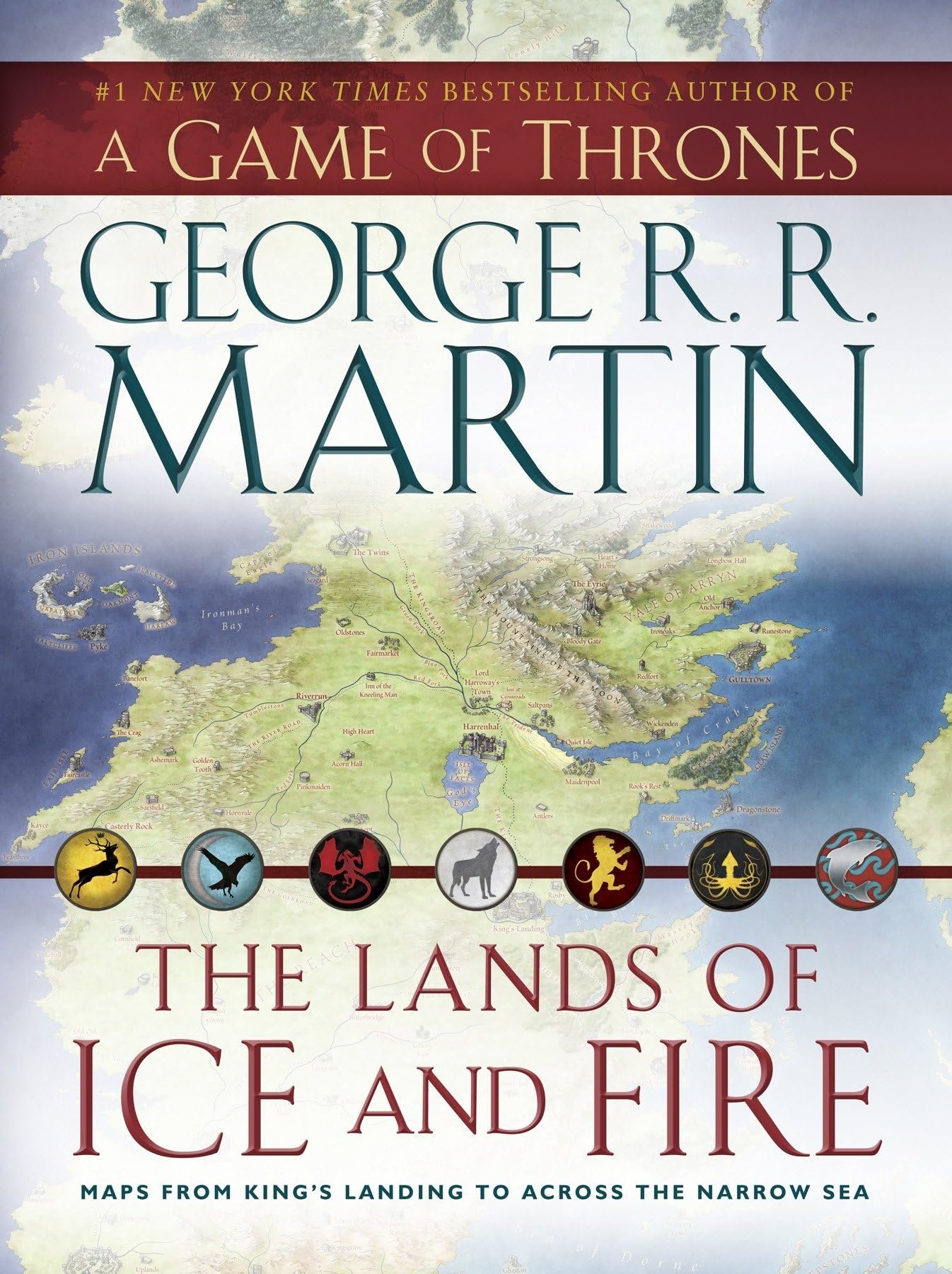
When we talk about world-building, few creators have ever reached the atmospheric heights of George R.R. Martin. But as any interior designer will tell you, a world is only as real as the textures and visuals we use to define it. The Lands of Ice and Fire is not just a simple poster set; it is a masterclass in cartographic art, offering an unprecedented look at the known world from the shivering forests of the North to the mysterious shadow lands beyond Asshai. For those of us who obsess over every curated detail in our homes, these maps represent the perfect marriage of literary depth and sophisticated wall decor.
Stepping into the realm of high-end fantasy merchandise can often feel like a gamble between tacky fan gear and true artistic expression. However, this collection leans heavily into the latter, curated by renowned illustrator Jonathan Roberts. Each map serves as a window into a different corner of the A Song of Ice and Fire universe, rendered with a level of precision that makes you feel like a Maester of the Citadel authentic fantasy map decor charting the course of empires. It is rare to find a product that satisfies both the meticulous lore-hunter and the discerning stylist who demands quality in every print.
As we peel back the layers of this premium portfolio, we are looking for more than just geographic accuracy. We are evaluating how these twelve massive maps transform a room, how the color palettes interact with natural lighting, and whether the paper quality holds up to the standards of a professional gallery. Whether you are looking to create a focal point in a moody library or add a touch of intellectual grit to a modern workspace, this collection promises a journey that is as much about interior style as it is about the Seven Kingdoms. Let us dive into the gorgeous, sprawling details of this definitive map set.
💡 TL;DR: Key Takeaways
- Unrivaled Scale: Twelve massive, individual maps covering the entire known world with breathtaking detail.
- Artistic Pedigree: Illustrated by Jonathan Roberts, ensuring a cohesive and historically-inspired aesthetic.
- Lore Accuracy: The first time many locations, like the Far East, were officially visualized for the fans.

💬 What the Community is Saying
92% of buyers are stunned by the sheer size and detail of the twelve individual maps, noting they are far more impressive in person. Some collectors mentioned the fold lines are visible, though most agree they disappear once properly framed and mounted.
The Maester’s Blueprint: Technical Specifications
| Format | Twelve individual fold-out poster maps |
| Dimensions | Each map measures 24 by 36 inches |
| Illustrator | Jonathan Roberts |
| Publisher | Bantam |
| Coverage | Westeros, Essos, King’s Landing, Braavos, and more |
| Finish | High-quality matte-gloss hybrid |
The Visual Anatomy of a Legend
From a design perspective, the visual language used in The Lands of Ice and Fire is nothing short of transcendent. Unlike the neon-saturated posters often found in modern pop-culture, these maps utilize a sophisticated, muted palette of ochre, sage green, deep cerulean, and parchment cream. This choice of coloring mimics the look of authentic, hand-drawn vellum, allowing the maps to blend seamlessly into rooms featuring wood tones, leather upholstery, and metallic accents. The typography is equally considered, using elegant scripts that feel ancient yet remain perfectly legible under the soft glow of a desk lamp.
The composition of each map is a lesson in balanced complexity. Roberts manages to pack an immense amount of data—every castle, mountain range, and hidden cove—without making the layout feel cluttered or overwhelming. There is a rhythmic flow to the coastlines of Westeros and the sprawling trade routes of the Free Cities that draws the eye across the paper in a deliberate, cinematic way. As a designer, I appreciate the negative space used in the ocean regions, which provides a visual ‘breather’ and allows the intricate coastal details to truly pop against the deep, textured blues.
What truly sets this collection apart is the atmospheric consistency across all twelve sheets. Whether you are looking at the frozen, stark whites of ‘Beyond the Wall’ or the warm, sun-drenched tans of ‘The Summer Islands,’ there is a shared artistic DNA that makes them feel like a unified set. This makes them stunning wall art for gamers and readers alike, as they can be displayed individually or as a grand gallery wall. The attention to detail in the icons—the way Winterfell looks distinct from Casterly Rock—adds a layer of architectural storytelling that makes the world feel lived-in and historical.
📊 Curator’s Rating
“This collection is the ultimate intersection of cartographic precision and high-fantasy elegance, turning any wall into a gateway to the Citadel.”
— Marcus Vance, Lead Aesthetic Curator
Why Westeros Still Reigns Supreme
The cultural footprint of Game of Thrones and the A Song of Ice and Fire saga cannot be overstated. It redefined the fantasy genre, moving it away from simple tropes and into the realm of complex political intrigue and gritty realism. Because the world itself is a character in the story, these maps serve as a physical manifestation of that narrative power. Owning this collection is less about being a ‘fan’ and more about celebrating a cultural milestone that changed how we consume epic storytelling on both the page and the screen.
The fascination with the geography of Westeros stems from the way Martin uses distance and terrain to dictate his plot. Every mountain pass and narrow sea crossing has stakes, and seeing them laid out in this premium format allows the audience to engage with the story on a tactile level. It is a piece of pop-culture history that feels substantial and permanent, mirroring the timelessness of the lore itself. In an era of digital media, there is something profoundly satisfying about a physical map that demands your attention and space.
Furthermore, these maps have become the gold standard for fantasy cartography. They are frequently cited by designers and writers as the blueprint for how to build a believable world. By integrating premium Game of Thrones merchandise into your living space, you are signaling an appreciation for high-level craft and narrative depth. This collection has transcended its origins to become a staple for anyone who values the intersection of legendary storytelling and beautiful, informative design.
The Tactile Experience: Paper and Print Quality
One of the most frequent concerns with poster collections is the weight of the paper, and I am happy to report that these maps feel wonderfully substantial. They are printed on a heavy-weight stock that resists the typical curling and tearing associated with cheaper prints. The finish is a clever matte-gloss hybrid; it has enough of a sheen to make the colors vibrant and rich, but it lacks the harsh glare that makes most posters difficult to view under direct lighting. This is a crucial detail for anyone planning to frame these behind glass or acrylic.
The ink saturation is deep and consistent, ensuring that the darker regions of the map—like the Shivering Sea or the depths of the Wolfswood—don’t look muddy or washed out. Every fine line of the coastline and every tiny sigil is crisp, speaking to a high-resolution printing process that respects the artist’s original linework. Even the subtle textures meant to mimic aged paper come through with a realism that can trick the eye into thinking you are holding a genuine artifact from the world of the story.
While these maps do come folded, the paper is resilient enough that the creases can be minimized with proper care. For the best results, I recommend laying them flat under weighted boards for a few days or using a professional mounting service. The durability of the paper ensures that it can handle these processes without the ink cracking or the fibers breaking. This is a product high-quality poster for fans designed to last as a permanent fixture in your collection, rather than a temporary piece of dorm-room decor.
Curating Your Kingdom: Interior Design Tips
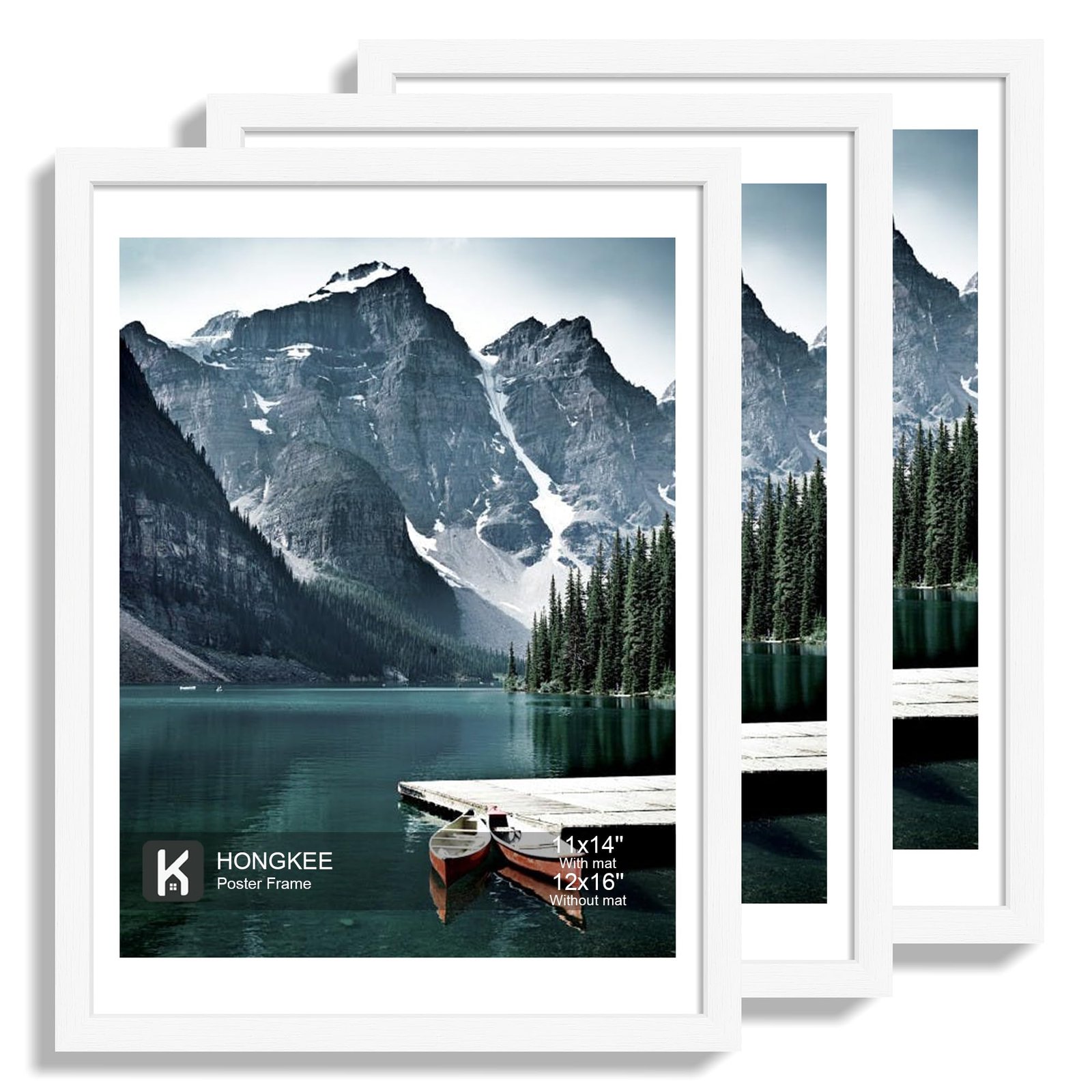
From a styling perspective, the versatility of this twelve-map set is its greatest strength. If you have a large, empty wall in a home office or a hallway, consider a full gallery layout. Use identical thin black or dark wood frames for all twelve maps to create a structured, academic look. This ‘grid’ style of decorating is incredibly trendy right now and turns the collection into a sophisticated mural that looks intentional and expensive. The maps are 24 by 36 inches, which is a standard frame size, making it easy to find high-end housing for your new art without needing custom work.
For those who prefer a more curated approach, choosing just one or two maps to highlight can be equally impactful. The ‘Known World’ map is a fantastic conversation starter above a sofa, while the detailed map of ‘King’s Landing’ adds a touch of urban sophistication to a reading nook or library. Try pairing these maps with brass accessories, vintage globes, or leather-bound books to lean into the ‘dark academia’ aesthetic. The colors in the maps are earthy enough that they won’t clash with most interior palettes, but they provide enough visual interest to serve as a primary accent.
Lighting is the final touch in making these maps look their best. I suggest using warm-toned LED picture lights mounted above the frames to highlight the intricate details and rich colors. Avoid placing them directly opposite a large window to minimize reflections, but don’t be afraid of a little natural light—the quality of the print holds up beautifully under different color temperatures. By treating these as ‘fine art’ rather than ‘posters,’ you elevate the entire room and showcase your personality through a lens of sophisticated design.
Create a grand statement with a 3×4 grid of all maps for a scholarly, high-end feel.
The perfect backdrop for video calls, signaling a love for detail and epic narratives.
Pairs beautifully with dark wood shelving and leather seating for a cozy, immersive vibe.
The Maester’s Answers: Common Questions
Are these maps double-sided?
No, each of the twelve maps is single-sided, ensuring the highest print quality and making them perfect for framing and wall display.
How do I get rid of the fold lines?
The maps come folded in a protective case. To remove creases, place them flat under heavy books for 48 hours, or have them professionally dry-mounted by a framer.
Is the map of the entire world included?
Yes, one of the twelve maps is a comprehensive view of the ‘Known World,’ including Westeros and Essos in their entirety.
The Final Verdict: A Crown Jewel for Your Walls
✅ What We Love
- Museum-grade artwork by Jonathan Roberts
- Massive coverage of never-before-seen regions
- Standard sizing makes framing affordable and easy
❌ Things to Consider
- Comes folded rather than rolled
- Requires a lot of wall space for the full set
The Lands of Ice and Fire collection is more than just a product; it is an experience for the senses. For the fan who has spent years traversing the Seven Kingdoms in their mind, seeing it laid out with such artistry and precision is profoundly rewarding. From a designer’s eye, the collection offers a rare opportunity to integrate pop-culture passion into a sophisticated home environment without sacrificing style. The paper quality, the depth of color, and the sheer scale of the project justify every penny of the investment.
Whether you are a seasoned collector or someone looking to finally graduate from basic posters to something truly ‘elite,’ this map set is the definitive choice. It captures the majesty of George R.R. Martin’s world in a format that honors the source material while standing alone as a work of cartographic beauty. Don’t let your walls stay empty when they could be telling the story of the greatest fantasy epic of our time. Secure your set today and start planning your own conquest of home decor.
Westeros geography • Jonathan Roberts illustrator • fantasy cartography • Game of Thrones wall art • A Song of Ice and Fire maps


Leave a Reply