
Transparency Disclosure: This site may contain affiliate links. We may earn a commission if you purchase through these links at no extra cost to you.
📑 Table of Contents
- 1. Stepping Into the Shadows: The Lush Aesthetic of Louis and Lestat
- 2. The Anatomy of an Immortal Classic
- 3. Chiaroscuro and Crimson: A Visual Design Breakdown
- 4. The Immortal Legacy of Anne Rice in Pop Culture
- 5. Ink, Paper, and the Tactile Experience
- 6. Curating Your Gothic Gallery: Styling and Framing
- 7. Frequently Asked Questions for the Discerning Collector
- 8. The Final Verdict: A Masterpiece of Gothic Graphic Art
About Our Review Methodology
At PosterHud, we don’t just look at pictures. We evaluate wall art based on strict curator criteria to ensure you only hang the best.
- Paper Weight & GSM
- Ink Vibrancy & Contrast
- Shipping & Tube Protection
- Franchise Authenticity
Stepping Into the Shadows: The Lush Aesthetic of Louis and Lestat
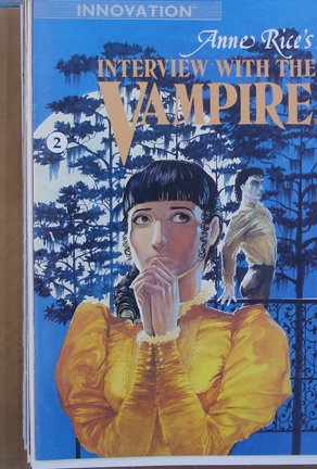
When we talk about the intersection of literary genius and visual splendor, few titles carry the weight of Anne Rice’s immortal chronicles. As an interior designer, I often find that the most compelling spaces are those that tell a story of layered history and moody elegance, much like the pages of the Anne Rice comic book adaptation. Issue number two of this series is not merely a piece of memorabilia; it is a gateway into the opulent, decaying world of 18th-century New Orleans. It captures that specific, evocative tension between the beautiful and the macabre that defines the gothic aesthetic we all secretly crave for our library shelves.
This particular installment continues the harrowing journey of Louis de Pointe du Lac as he navigates his fledgling immortality under the erratic, charismatic tutelage of Lestat. From a narrative perspective, it hits all the right beats, but from a design perspective, it is a masterclass in atmospheric storytelling. The ink-washes and character silhouettes provide a textured depth that feels almost tactile, reminiscent of heavy velvet curtains and antique mahogany furniture. It is the kind of medium that invites you to linger on every panel, absorbing the Victorian-era details that Rice famously described with such painstaking precision.
Reviewing this comic feels like auditing a vintage estate; there is a sense of discovery in every shadow. Whether you are a lifelong fan of the Brat Prince or a newcomer drawn in by the recent television resurgence, this comic serves as a foundational piece of visual media. It manages to translate the internal monologue of a suffering soul into a sequence of images that are as haunting as they are sophisticated. In this pillar-page review, we are going to dissect why this specific issue is a must-have gothic collectible for anyone looking to curate a home office or reading nook with a darker, more intellectual edge.
💡 TL;DR: Key Takeaways
- Visual Fidelity: The art style perfectly captures the melancholic atmosphere of 1790s Louisiana.
- Narrative Depth: It maintains the philosophical weight of the original novel while making it accessible.
- Collector Value: A rare intersection of high-concept literature and vintage comic book artistry.
💬 What the Community is Saying
Most readers are captivated by the exquisite pencil work and faithful tone, though some purists wish the issue was longer to accommodate more of Rice’s prose. Overall, it is highly praised as a superior adaptation compared to standard genre fare.
The Anatomy of an Immortal Classic
| Title | Anne Rice’s Interview With The Vampire #2 |
| Writer | Anne Rice (Original Story) |
| Art Style | Gothic Noir / Detailed Lineage |
| Dimensions | Standard Comic Size (approx 6.6 by 10.2 inches) |
| Era | Late 18th Century Historical Setting |
| Publisher | Innovation Publishing |
Chiaroscuro and Crimson: A Visual Design Breakdown
The visual anatomy of this comic is a triumph of Chiaroscuro—the dramatic use of light and shadow. As a designer, I am constantly looking at how contrast creates focus, and this issue utilizes deep, saturated blacks to swallow the backgrounds, making the pale, ethereal features of Louis and Lestat pop with an almost ghostly luminescence. The linework is delicate yet intentional, echoing the intricate lace and ruffles of the period costumes. It does not just show you a scene; it makes you feel the humidity of the swamp and the stale air of a shuttered plantation manor.
Color theory plays a massive role in the emotional resonance of Issue #2. We see a palette dominated by sepia tones, muted earth shades, and the occasional, jarring splash of crimson. This is not the bright, primary-colored world of superheroes; this is a sophisticated, somber arrangement that mirrors a well-appointed dark academia mood board. The artist understands that the horror of the vampire is best served with a side of beauty, ensuring that even the most gruesome moments are rendered with a certain poetic grace that honors the source material’s romantic roots.
Compositionally, the panels are arranged to mimic the flow of a confession. There is a rhythmic quality to the layout, with wide cinematic shots of the New Orleans skyline interspersed with tight, claustrophobic close-ups that emphasize the characters’ internal agony. This balance of scale is exactly what I look for when styling an art wall—you need the grand gestures to catch the eye and the intimate details to keep the heart engaged. It is a masterclass in visual pacing that elevates the comic from a simple adaptation to a standalone work of fine art.
📊 Curator’s Rating
“This comic is a lush, ink-drenched love letter to the romanticized shadows of the 18th century.”
— Marcus Vance, Lead Aesthetic Curator
The Immortal Legacy of Anne Rice in Pop Culture
Anne Rice did more than just write books; she birthed an entire subculture. Before her vampires took center stage, the undead were often portrayed as mindless monsters or caped caricatures. Interview with the Vampire introduced the ‘sympathetic vampire,’ an introspective, tragic figure that paved the way for everything from Buffy to Twilight. This comic book series represents a crucial moment in that evolution, bringing a tactile, visual dimension to the ‘Vampire Chronicles’ long before the silver screen took its turn. It solidified the image of the vampire as a dandy, a philosopher, and a tormented artist.
The cultural impact of Rice’s work extends deeply into the world of interior design and fashion. The ‘Vampire Aesthetic’—characterized by velvet, wrought iron, candelabras, and ornate gold leaf—is a direct descendant of the descriptions found in these pages. By owning this comic, you are holding a piece of the blueprint for the modern gothic movement. It is a testament to how literature can escape the confines of a book and influence the very way we decorate our lives, favoring the ornate over the sterile and the timeless over the trendy.
Furthermore, this specific collectible vampire comic serves as a bridge between high-brow literature and pop-culture collectibles. It validates the graphic novel as a serious medium for complex storytelling. In an era where we are inundated with digital content, there is a profound cultural rebellion in returning to a physical, printed page that demands your full attention. This comic is a relic of a time when we weren’t afraid to let our monsters be beautiful, complicated, and devastatingly stylish.
Ink, Paper, and the Tactile Experience
The paper quality of this issue reflects the era of its printing—a nostalgic, slightly toothy stock that holds ink with a matte finish. Unlike the high-gloss, hyper-digital prints of today, this comic feels organic. The way the ink settles into the fibers of the paper gives the shadows a velvet-like appearance that digital screens simply cannot replicate. For a collector, the feel of the page under the thumb is half the experience, and there is a satisfying weight to this issue that speaks to its durability as a legacy piece.
Ink saturation is particularly important when dealing with the gothic genre, as the blacks need to be deep enough to provide contrast without muddying the details. In this issue, the blacks are rich and consistent, providing a crisp frame for the finer details of the background art. You can see the individual strokes of the pen, giving it a handcrafted feel that aligns with the artisanal values of high-end interior design. It feels less like a mass-produced product and more like a limited-edition lithograph found in a boutique gallery.
When we discuss durability, the spine and staples of this era of comic book production were built to last, provided they are kept in a climate-controlled environment. To maintain the integrity of the colors and the crispness of the edges, I always recommend archival-grade sleeves. The preservation of these materials is an art form in itself, ensuring that the haunting beauty of the artwork remains vibrant for the next generation of nocturnally-inclined readers.
Curating Your Gothic Gallery: Styling and Framing
From a design perspective, a comic book is essentially a miniature art gallery. To truly showcase the aesthetic of Interview with the Vampire #2, I recommend a floating frame. By suspending the comic between two sheets of glass, you allow the edges of the paper to show, emphasizing its status as a vintage artifact. Place this against a dark, moody wall—think charcoal, deep navy, or even a forest green—to let the sepia and white tones of the cover art pop. It adds an intellectual, curated feel to any room, serving as an instant conversation starter for fellow bibliophiles.
If you prefer a more layered approach, try leaning the framed comic on a bookshelf alongside leather-bound classics, a small brass bust, and perhaps a dried rose in a bell jar. This ‘vignette’ style of decorating creates a story within your space. The comic acts as a modern bridge between the old-world charm of the books and the contemporary edge of graphic art. It is about creating a sensory experience where the visual narrative of the comic complements the physical textures of your decor.
Lighting is the final touch for styling this piece. Avoid direct sunlight, which can fade those precious ink washes. Instead, use a focused picture light or a nearby table lamp with a warm-toned bulb to cast a soft glow over the cover. This mimics the candlelight often seen within the story itself, bringing the artwork to life in a way that feels immersive. Your home should be a reflection of your passions, and displaying a piece of the Rice legacy shows a commitment to timeless, soulful storytelling.
Its historical weight and gothic charm make it the perfect companion for a room filled with books and deep-seated armchairs.
Add a touch of creative inspiration to your workspace; the moody art style fosters a deep, focused atmosphere for writing or designing.
Place it on a nightstand or vanity to lean into the romantic, nocturnal vibes that Anne Rice so famously championed.
Frequently Asked Questions for the Discerning Collector
Is this a direct adaptation of the novel?
Yes, it follows the narrative arc of the original book very closely, capturing the specific dialogue and atmosphere that Anne Rice fans adore.
What is the best way to display this without damaging it?
Use a UV-protected frame or a Mylar sleeve. For decor purposes, a shadow box also works beautifully to protect the comic while adding depth to your wall.
The Final Verdict: A Masterpiece of Gothic Graphic Art
✅ What We Love
- Stunning Chiaroscuro Art
- Faithful Literary Adaptation
- High Decorative Potential
❌ Things to Consider
- Older Paper Can Yellow
- Rare and Harder to Find
In the world of interior design, we often say that a room without art is a room without a soul. Anne Rice’s Interview With The Vampire Comic Book #2 is more than just a sequence of drawings; it is a soulful, evocative piece of cultural history. It manages to capture the essence of Louis’s eternal struggle and Lestat’s flamboyant cruelty with a visual sophistication that is rare in the comic medium. Whether you are looking to complete a collection or simply want a stunning piece of gothic art to anchor your favorite reading nook, this issue is an absolute triumph.
Do not let this piece of immortality slip through your fingers. It is a rare opportunity to own a visual extension of one of the greatest horror stories ever told. If you value design, story, and the enduring allure of the night, adding this to your personal archives is a decision you will never regret. Secure your copy, find a quiet corner, and let the shadows of New Orleans wash over you once again. Would you like me to help you find a specific archival frame that matches your current room aesthetic?


Leave a Reply