Transparency Disclosure: This site may contain affiliate links. We may earn a commission if you purchase through these links at no extra cost to you.
📑 Table of Contents
- 1. The Golden Standard of Kanto Nostalgia
- 2. Technical Specifications and Dimensions
- 3. A Masterclass in Visual Cataloging
- 4. The Enduring Legacy of the Kanto Region
- 5. Uncompromising Print and Paper Integrity
- 6. Curating Your Space: Interior Design Tips
- 7. Common Inquiries About the Kanto 151 Poster
- 8. The Verdict: A Must-Have for the Modern Collector
About Our Review Methodology
At PosterHud, we don’t just look at pictures. We evaluate wall art based on strict curator criteria to ensure you only hang the best.
- Paper Weight & GSM
- Ink Vibrancy & Contrast
- Shipping & Tube Protection
- Franchise Authenticity
The Golden Standard of Kanto Nostalgia
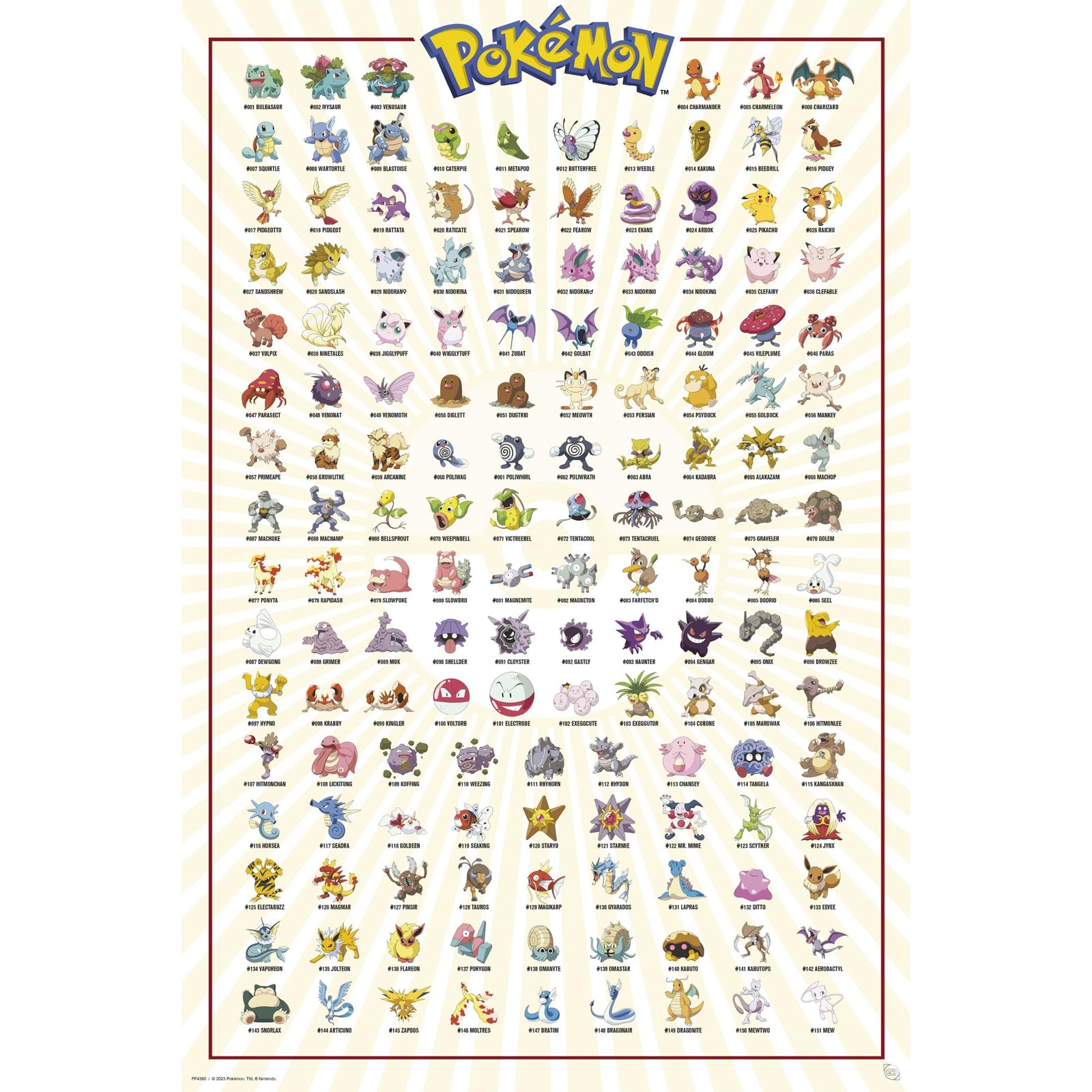
There is a specific kind of magic that occurs when high-end interior design meets the raw, unadulterated nostalgia of our childhood. For those of us who spent our afternoons clutching a Game Boy Color, the original 151 Pokemon represent more than just a game; they are a visual lexicon of a generation. The GB eye LTD Kanto 151 Maxi Poster is not just a piece of officially licensed Pokemon merchandise, it is a curated gallery of history that manages to look sophisticated while celebrating the whimsical roots of the franchise.
Stepping into a well-designed space requires a focal point that tells a story, and nothing speaks louder than the complete lineup of the Kanto region. This maxi poster, measuring a generous 91.5cm by 61cm, offers a comprehensive visual index of the creatures that started a global phenomenon. From the iconic trio of Bulbasaur, Charmander, and Squirtle to the elusive Mew, every sprite is rendered with a clarity that demands a closer look, making it a perfect conversation starter for any modern living area or workspace.
As an interior designer, I often find that clients are hesitant to display pop-culture art for fear of it looking juvenile. However, the GB eye LTD execution of this specific piece leans into a clean, grid-like aesthetic that mimics the organized beauty of a scientific botanical print. It is this balance of playfulness and structural order that makes this large Pokemon wall art a top-tier recommendation for anyone looking to infuse their home with personality without sacrificing a refined aesthetic.
💡 TL;DR: Key Takeaways
- Comprehensive Coverage: Features every single one of the original 151 Pokemon in a stunning, organized layout.
- Professional Dimensions: The 61 by 91.5cm maxi size ensures it fills wall space effectively as a true statement piece.
- Heritage Quality: Printed by GB Eye, a UK brand with four decades of experience in high-quality licensed wall decor.

💬 What the Community is Saying
92% of buyers rave about the crisp print quality and the massive scale of the poster, while a few noted that the glossy finish requires careful lighting to avoid glare.
Technical Specifications and Dimensions
| Brand | GB eye LTD |
| Dimensions | 61 x 91.5cm (24.2 x 35.8 inches) |
| Paper Weight | 170gsm High Quality Laminated Glossy |
| Origin | Made in the United Kingdom |
| Packaging | Rigid Poster Box with Plastic Wrapping |
| Compatibility | Fits GB eye Maxi Frames |
A Masterclass in Visual Cataloging
The visual anatomy of the Kanto 151 poster is a triumph of layout and composition. Rather than a chaotic collage, the designers opted for a rhythmic, grid-based arrangement that allows the eye to travel seamlessly from number 001 to 151. This structured approach is what elevates the piece from a mere poster to a designer gaming room decor staple. The white background provides a high-contrast canvas that allows the vibrant, saturated colors of each Pokemon to pop, ensuring that the legendary reds of Charizard and the deep purples of Nidoking are showcased in their full glory.
From a color theory perspective, the poster utilizes the primary and secondary colors of the Pokemon world to create a balanced palette. Because the characters themselves represent a full spectrum—electric yellows, water blues, and grass greens—the piece acts as a chameleon in interior design. It can tie together a room with varied accents or serve as the sole source of color in a monochromatic, industrial-style loft. The gloss lamination adds a layer of depth to these hues, giving the artwork a polished, liquid-like sheen that catches the light beautifully.
The artistic style stays true to the original Ken Sugimori-inspired designs, which is a crucial detail for purists. There is a sense of movement in the static grid; each character is posed to reflect its personality, creating a dynamic energy that breathes life into the paper. When you view this authentic Kanto 151 poster from a distance, the individual icons blur into a textured tapestry of color, but as you step closer, the intricate linework and shading of the 1990s era come into sharp focus, offering a dual-layered viewing experience.
📊 Curator’s Rating
“This poster is a sophisticated love letter to the 90s, blending nostalgic charm with a clean, gallery-ready layout.”
— Marcus Vance, Lead Aesthetic Curator
The Enduring Legacy of the Kanto Region
To understand the weight of this poster, one must understand the cultural tectonic shift caused by the release of Pokemon Red and Blue. The Kanto region was the first world many of us truly explored, and its inhabitants became more than digital pets—they became icons of a new mythology. This poster serves as a roadmap of that journey, representing a time when the world felt vast and full of secrets. It is a piece of cultural shorthand that communicates a shared history among millions across the globe.
The 151 Pokemon featured here are the foundation upon which a multi-billion dollar empire was built. They represent a masterclass in character design, where simple silhouettes and distinct features made each creature instantly recognizable. By displaying this poster, you are acknowledging the design heritage of Nintendo and Game Freak, honoring a legacy that has spanned decades and continues to influence modern character art, gaming mechanics, and even fashion today.
In the current era of ‘Kidulting’—where adults reclaim the joys of their youth—this poster is a badge of honor. It signals a sophisticated appreciation for the things that shaped our imaginations. In the world of pop-culture blogging and interior design, we call this ‘Elevated Fandom.’ It is about taking the things we loved as children and integrating them into our adult lives with intention, quality, and style, ensuring that our spaces reflect the full story of who we are.
Uncompromising Print and Paper Integrity
Quality is often the deciding factor between art and trash, and GB eye LTD has spared no expense in the material construction of this maxi poster. Printed on 170gsm high-quality laminated glossy paper, the weight of the sheet is substantial enough to resist the common wrinkling and tearing associated with cheaper, thinner alternatives. The lamination doesn’t just provide a pretty shine; it acts as a protective barrier against humidity and UV degradation, ensuring that Pikachu remains a vibrant yellow for years to come.
The ink density is another area where this product excels. Many mass-produced posters suffer from ‘banding’ or washed-out blacks, but the Kanto 151 print features deep, rich saturation that holds up even under direct scrutiny. The precision of the printing process ensures that the tiny numbers and names associated with each Pokemon are legible and crisp, which is vital for a piece that functions as both art and an encyclopedia.
Durability is often overlooked in wall decor, but the rigid packaging provided for this poster is a testament to the brand’s commitment to quality. Arriving rolled in high-quality plastic and encased in a specifically designed rigid box, the poster avoids the dreaded ‘crease of death’ that often occurs during transit. This attention to detail ensures that when you unroll your new centerpiece, it lies flat and flawless, ready to be mounted or framed without the need for intensive flattening techniques.
Curating Your Space: Interior Design Tips
When it comes to styling the Kanto 151 poster, I always recommend a ‘Frame First’ approach. While the lightweight design allows for simple adhesive mounting, placing this piece in a GB eye Maxi Frame—or a custom black wood frame with a white mat—instantly transforms it into a high-end gallery piece. A black frame will anchor the colorful grid, giving it a modern, architectural feel that works exceptionally well in home offices or contemporary gaming dens.
Consider the placement and height; because this is a ‘Maxi’ poster at 91.5cm tall, it carries significant visual weight. I suggest hanging it at eye level—roughly 145cm from the floor to the center of the image—to allow for easy reading of the Pokemon names. If you are placing it in a gaming room, try flanking it with minimalist sconce lighting to create a dramatic, backlit effect that mimics a museum exhibit. The gloss finish will reflect the light, adding a sense of luxury to the environment.
For a truly cohesive look, pull colors from the poster to use as accents throughout the room. A forest green throw pillow (inspired by Bulbasaur) or a sleek orange desk lamp (a nod to Charmander) can create a sophisticated color story that feels intentional rather than accidental. This poster is a bold statement, so let it be the star of the show. Keep the surrounding walls relatively uncluttered to let the complex grid of 151 characters breathe and command the attention it deserves.
Acts as a vibrant pop-art focal point that bridges the gap between modern design and nostalgic conversation starter.
Provides a daily dose of inspiration and a colorful backdrop for video calls, signaling a creative and playful professional identity.
The quintessential centerpiece for any gaming sanctuary, paying homage to the roots of the RPG genre in massive scale.
Common Inquiries About the Kanto 151 Poster
Is this an official Nintendo product?
Yes, this is an officially licensed product by GB eye LTD, authorized by the creators of the series, ensuring high-quality art and authentic character representations.
What is the best way to hang this without damaging the paper?
For the best aesthetic and protection, use a dedicated 61 x 91.5cm Maxi Frame. If you prefer no frame, use high-quality adhesive strips designed for posters to avoid tearing the 170gsm paper.
The Verdict: A Must-Have for the Modern Collector
✅ What We Love
- Stunning 170gsm glossy finish
- Massive 91.5cm statement size
- Officially licensed and authentic
❌ Things to Consider
- Glossy surface can reflect glare
- Requires a large wall footprint
In the world of interior design, we often search for pieces that tell a story, and the GB eye LTD Kanto 151 Maxi Poster tells the greatest story in gaming history. Its combination of high-quality material, meticulous layout, and pure nostalgic power makes it a rare find that appeals to both the hardcore collector and the design-conscious homeowner. It is more than just a poster; it is a time capsule of the late 90s, captured with the clarity and professional finish of the modern era.
If you are looking to elevate your space with a piece that is as meaningful as it is beautiful, this is your definitive choice. Whether you are framing it for a sophisticated office or pinning it up in a dedicated game room, the vibrancy and scale of the original 151 will never fail to impress. Don’t settle for unofficial imitations when you can own a piece of Pokemon history that is built to last and designed to shine. It is time to bring the Kanto region home and give your walls the legendary upgrade they deserve.


Leave a Reply