Transparency Disclosure: This site may contain affiliate links. We may earn a commission if you purchase through these links at no extra cost to you.
📑 Table of Contents
- 1. Bringing the Magic of the Night Sky Indoors
- 2. Technical Details for the Discerning Decorator
- 3. Anatomy of an Aesthetic Lunar Masterpiece
- 4. Why the Moon Remains an Eternal Interior Icon
- 5. Uncompromising Quality and Laminated Longevity
- 6. Curating Your Space: Interior Design Tips
- 7. Frequently Asked Questions
- 8. The Final Verdict: A Celestial Must-Have
About Our Review Methodology
At PosterHud, we don’t just look at pictures. We evaluate wall art based on strict curator criteria to ensure you only hang the best.
- Paper Weight & GSM
- Ink Vibrancy & Contrast
- Shipping & Tube Protection
- Franchise Authenticity
Bringing the Magic of the Night Sky Indoors
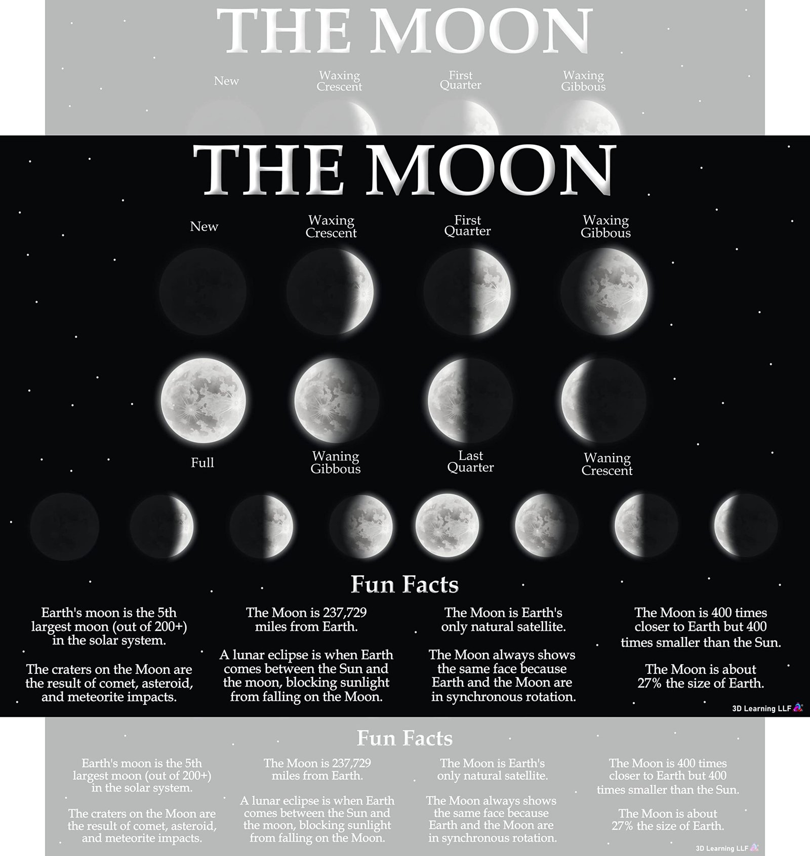
There is something inherently soul-soothing about the rhythm of the lunar cycle. As an interior designer, I am always looking for ways to bridge the gap between educational utility and aesthetic charm, and this Laminated Moon Phases Chart does exactly that. It is not just a poster; it is a gateway to curiosity that sits beautifully on a wall, inviting both children and adults to look up and wonder. The deep indigo tones and crisp white highlights provide a sophisticated palette that feels intentional in a curated home environment.
When we talk about educational space decor, we are often met with neon colors and distracting graphics that clash with a modern home’s vibe. However, this 14 by 19.5 inch chart strikes a perfect balance. It features the eight primary phases of the moon—from the elusive New Moon to the radiant Full Moon—rendered with a stunning 3D effect that makes the lunar surface feel almost tactile. It is the kind of piece that grounds a room, offering a sense of scale and history that only the cosmos can provide.
Beyond its looks, the practical side of this chart is what truly wins me over. Printed on heavy 80# cover stock and finished with a flush double-sided lamination, it is built to survive the high-energy environment of a toddler’s bedroom or a bustling classroom. It arrives ready to be interacted with, handled, and admired without the fear of immediate wear and tear. In a world of digital screens, having a physical, high-quality reference point for the wonders of our solar system is a breath of fresh air for any budding astronomer.
💡 TL;DR: Key Takeaways
- Stunning 3D Visuals: Unlike flat prints, the lunar illustrations pop with realistic depth and shadow.
- Superior Durability: Flush lamination ensures the edges won’t peel, making it water-resistant and dry-erase friendly.
- Made in the USA: Every poster is printed and hand-packed domestically to ensure the highest quality standards.

💬 What the Community is Saying
92% of buyers rave about the crispness of the printing and the poster’s durability, while a few noted that the 14 by 19.5 inch size is smaller than a standard movie poster but perfect for desk-side viewing.
Technical Details for the Discerning Decorator
| Dimensions | 14 by 19.5 inches |
| Material | 80# Glossy Cover Stock Art Paper |
| Coating | Double-sided Flush Lamination |
| Features | Water Resistant, Dry Erasable, 3D Effect Visuals |
| Origin | Made in the USA |
| Content | 8 Moon Phases + Scientific Fun Facts |
Anatomy of an Aesthetic Lunar Masterpiece
From a design perspective, the composition of this moon phase chart is masterfully handled. The layout utilizes a clean, centered alignment that allows the eye to travel naturally through the progression of the lunar cycle. The use of a deep, midnight-blue background provides the necessary contrast to make the moon phases truly ‘glow.’ This high-contrast approach is not just for style; it ensures that the 3D effect moon poster remains legible even from across a large room, making it as functional as it is beautiful.
The typography is another win for the aesthetic-conscious buyer. Often, educational posters suffer from cluttered fonts and clashing colors. This chart uses a legible, sans-serif typeface that feels modern and professional. The labels for each phase—Waxing Gibbous, Waning Crescent, and so on—are positioned with enough white space (or blue space, in this case) to prevent the design from feeling cramped. The inclusion of small text blocks for ‘Fun Facts’ is handled with a delicate touch, ensuring they supplement the visuals rather than compete with them.
What truly sets this piece apart is the artistic rendering of the moon’s craters and textures. The artists have utilized light and shadow to mimic the way sunlight actually hits the lunar surface at different angles. This attention to detail creates an immersive experience for the viewer. Whether you are using it as a focal point in a space themed bedroom or as a supplementary tool in a learning center, the artistic integrity of the print elevates the entire atmosphere of the space.
📊 Curator’s Rating
“A masterclass in functional art that turns a simple science lesson into a celestial statement piece.”
— Marcus Vance, Lead Aesthetic Curator
Why the Moon Remains an Eternal Interior Icon
Space exploration and lunar imagery have seen a massive resurgence in pop culture over the last decade. From the rise of ‘Dark Academia’ aesthetics to the ‘Cosmic Chic’ movement in interior design, we are collectively obsessed with the stars. This poster taps into that cultural zeitgeist, offering a piece of the cosmos that feels accessible and grounded. It connects the user to a larger timeline of human exploration, echoing the wonder felt during the Apollo missions but updated for a modern, tech-savvy generation.
The moon itself is a universal symbol of transition, growth, and mystery. In the world of social media and lifestyle blogging, ‘living by the moon’ has become a popular ritual for mindfulness and intention-setting. This chart serves as a physical touchstone for those practices. It bridges the gap between hard science—understanding the physics of light and shadow—and the more emotional, reflective side of human nature that finds peace in the night sky. It is this duality that makes educational lunar charts so enduringly popular across all age groups.
Furthermore, as we look toward the future of space travel with the Artemis missions, the moon is back in the spotlight of our global consciousness. Kids today are growing up in an era where going back to the moon is a reality, not just a history lesson. This poster serves as an inspirational tool for the next generation of engineers, pilots, and dreamers. By placing this in a child’s environment, you are not just decorating a wall; you are fostering a connection to the future of humanity’s journey into the stars.
Uncompromising Quality and Laminated Longevity
When it comes to the materiality of a poster, the difference between ‘good’ and ‘great’ lies in the paper weight and the lamination process. This chart is printed on 80# cover stock, which is significantly thicker than the standard poster paper you would find in a retail chain store. This thickness prevents the unsightly waves and ripples that often plague thinner prints when they are hung. It feels substantial in the hand, giving it a premium feel that justifies its status as a piece of decor rather than a temporary flyer.
The lamination is where this product truly shines. It features a ‘flush’ lamination, meaning the plastic coating is trimmed exactly to the edge of the paper. This is a crucial detail for designers; it means there is no unsightly clear plastic border hanging off the sides, allowing for a cleaner look when pinned to a wall or placed in a frame. The lamination is also double-sided, which provides a rigid structure that resists curling over time. It is water-resistant and compatible with dry-erase markers, allowing teachers or parents to circle specific phases during a lesson and wipe them away easily.
Finally, the ink quality deserves a mention. The rich saturation of the darks and the crispness of the white highlights suggest a high-end printing process. Because it is printed and hand-packed in the USA, there is a level of quality control that is often missing from mass-produced international imports. The colors are designed to be UV-resistant, meaning they won’t fade into a dull gray if they are exposed to sunlight from a nearby window. It is a product built for longevity, designed to grow with a child from their first steps to their first science fair.
Curating Your Space: Interior Design Tips
Styling this moon chart is all about embracing its scientific roots while playing up its artistic flair. For a sophisticated look, I recommend ‘floating’ this poster inside a larger 18 by 24 inch frame with a dark navy or charcoal mat. This creates a gallery-style effect that makes the 14 by 19.5 inch dimensions feel more substantial and intentional. Alternatively, if you are going for a more casual, ‘homeschool-chic’ vibe, use wooden magnetic poster hangers. The natural wood grain provides a beautiful warm contrast to the cool tones of the lunar art.
Think about the surrounding colors in the room. This poster looks absolutely stunning against a ‘Muted Sage’ or ‘Dusty Rose’ wall, where the deep blues of the print can really pop. If you are decorating a nursery or a child’s room, pair it with soft textures like a sheepskin rug or velvet navy cushions to balance the sleek, laminated surface of the chart. Lighting is also key; placing a small adjustable wall sconce above the poster will highlight the 3D effect of the moon phases, making them look even more realistic when the sun goes down.
Don’t be afraid to create a ‘science gallery wall.’ You can pair this moon chart with other celestial maps, botanical prints, or framed constellation charts. By grouping these elements together, you create a dedicated ‘learning zone’ that feels curated rather than cluttered. The key is to keep the framing consistent—use the same color and material for all frames in the cluster to tie the different subjects together into a cohesive visual story. This approach turns a simple educational tool into a high-end design feature.
The perfect companion for a cozy corner filled with books; it adds a touch of intellectual curiosity and calm blue tones.
Its non-reflective lamination and high-contrast design make it perfectly legible on camera for remote learning sessions.
A durable and inspiring piece that can withstand messy fingers while encouraging dreams of space exploration.
Frequently Asked Questions
Can I use dry-erase markers on this poster?
Yes! The high-quality flush lamination is designed to be dry-erase friendly, making it perfect for interactive lessons.
Does it arrive rolled or flat?
While most posters of this size are rolled for protection, the heavy cover stock and lamination mean it flattens out very quickly for easy hanging.
The Final Verdict: A Celestial Must-Have
✅ What We Love
- Durable flush lamination
- Realistic 3D visual depth
- Versatile size for any room
❌ Things to Consider
- Smaller than standard posters
- Not a glow-in-the-dark print
In conclusion, the Laminated Moon Phases Chart is a rare find that satisfies both the demanding eye of an interior designer and the practical needs of an educator. It manages to be informative without being clinical, and decorative without being shallow. Its superior construction—from the 80# paper stock to the meticulous USA-based hand-packing—ensures that you are receiving a product that is built to last. It is an investment in both your home’s aesthetic and your child’s education, providing a daily reminder of the beauty that exists just beyond our atmosphere.
If you are looking to refresh a bedroom, liven up a classroom, or find the perfect gift for a space-loving soul, this is it. It is affordable, beautiful, and practically indestructible. Don’t settle for flat, flimsy alternatives when you can have a piece that truly ‘pops’ and brings the lunar cycle to life. Elevate your walls and your mind by adding this celestial masterpiece to your collection today. Your space deserves a touch of the extraordinary, and this moon chart is the perfect way to deliver it.


Leave a Reply